
Most attorneys think about their website in terms of how it looks. Does it look professional? Does it look modern? Does it look like the kind of website a successful law firm would have?
These are reasonable questions. But they are the wrong questions.
The right question is: does your website convert visitors into consultation requests?
A law firm website that looks impressive but does not convert is a liability, not an asset. And most law firm websites — even expensive ones built by reputable agencies — fall into this category. They look good. They do not work.
This guide explains what separates attorney website design that converts from attorney website design that just looks good — and what you can do if your current website falls into the second category.
Why Most Attorney Websites Do Not Convert
Before we get into what works, it helps to understand why most attorney websites fail at conversion.
They are designed to impress other attorneys, not to reassure potential clients. There is a significant difference between what attorneys find impressive and what makes a scared, confused potential client pick up the phone. Credentials and accomplishments matter, but they need to be presented in a way that answers the question every visitor is asking: “Can this attorney help me with my specific problem?”
They bury the contact information. It sounds basic, but an astonishing number of law firm websites make it genuinely difficult to find a phone number or contact form. If a visitor has to scroll or navigate to find a way to reach you, most of them will not bother.
They load too slowly. Google’s research shows that 53% of mobile users abandon a page that takes more than 3 seconds to load. Most attorney websites were not built with performance as a priority. They are slow, and they lose visitors because of it.
They are not built for mobile. Over 60% of legal searches happen on a smartphone. If your website was designed primarily for desktop, you are providing a poor experience to the majority of your visitors.
They do not speak to the visitor’s specific situation. Generic copy — “We fight for your rights” or “Experienced attorneys you can trust” — does not convert because it does not connect with what the visitor is actually going through. Effective attorney website design speaks directly to the specific problem the visitor has and the outcome they want.
The 6 Elements of Attorney Website Design That Converts
These are the elements that separate high-converting law firm websites from the ones that look good but do nothing.
1. A Clear, Immediate Answer to “Can You Help Me?”
The moment a visitor lands on your website, they are asking one question: can this attorney help me with my specific situation?
Your homepage hero section — the first thing visitors see before they scroll — needs to answer this question immediately. Not with a tagline about your values or a photo of your office. With a clear, direct statement of who you serve and what you do for them.
For example: “Personal injury attorney for car accident victims in Houston — call now for a free consultation” is infinitely more effective than “Dedicated to justice for our clients.”
2. A Phone Number That Is Always Visible
Your phone number should be in the header of every page, visible without scrolling, and formatted as a click-to-call link on mobile. This is one of the highest-impact changes any law firm website can make, and it is often missing.
If a visitor is ready to call, make it effortless. Do not make them scroll to the footer to find your number.
3. Practice Area Pages Written for the Client, Not the Attorney
Most law firm websites have practice area pages that read like a legal brief — dense with terminology, long on description of the law, short on what the client actually wants to know: what will happen, how you can help, and what to do next.
Effective practice area pages are written from the client’s perspective. They address the specific situation the client is in, explain the process in plain language, establish credibility, and include a clear call to action.
4. Trust Signals Placed Where They Matter
Credentials, bar admissions, awards, and client testimonials matter — but only if they are placed where visitors actually look.
Eye-tracking research consistently shows that most website visitors do not scroll to the bottom of a page. Trust signals that are buried at the bottom of a long page are effectively invisible. Place your most compelling credibility indicators — a strong testimonial, a relevant credential, a case result — above the fold or within the first scroll of each key page.
5. Fast Load Times on Mobile
This is not optional. A slow website is a leaking bucket — traffic comes in, but visitors leave before they convert.
Every attorney website should load in under 2 seconds on mobile. If yours does not, that is almost certainly costing you consultations. Page speed can be tested using Google’s free PageSpeed Insights tool. A mobile score below 50 is a significant problem.
6. One Clear Next Step on Every Page
Every page of your website should have one clear, obvious next step for the visitor. Usually this is “book a free consultation” or “call now.” Sometimes it is “read more about this practice area.”
The mistake most attorney websites make is giving visitors too many options — three different CTAs, a newsletter signup, a social media follow button, and a chatbot all competing for attention. Fewer choices means more conversions. Pick one next step per page and make it obvious.
The Difference Between Affordable and Cheap Attorney Website Design
One of the most common concerns attorneys have about website design is cost. And it is a legitimate concern — the range of prices in the market is enormous, from a few hundred dollars to tens of thousands.
The distinction worth understanding is between affordable and cheap.
Affordable attorney website design means you get a professionally designed, properly optimized website at a price that makes sense for your firm’s stage and budget. At Attorney Website Designers, our packages start at $997 — which covers custom design, mobile-first development, on-page SEO setup, and 30 days of post-launch support.
Cheap attorney website design means you get a template, minimal customization, no SEO foundation, and no real understanding of what makes a law firm website work. It costs less upfront and significantly more in the long run — either because you need to rebuild it, pay an SEO agency to fix what was not done correctly, or simply accept a website that does not convert.
The right question is not “how little can I spend?” It is “what is the return on investing in a website that actually works?”
If your average case value is $5,000 and a properly designed website generates two additional consultations per month that convert to clients, that is $10,000 per month in additional revenue from a one-time investment.
How to Evaluate Your Current Attorney Website Design
If you already have a website and are not sure whether it is converting, here is a quick self-assessment:
Open your website on your phone. Is your phone number immediately visible? Can you find the contact form in under 10 seconds? Does the page load quickly?
Read your homepage hero section. Does it immediately tell a visitor who you serve and what you do for them? Or does it start with a tagline, your firm name, or a general statement about your values?
Check your page speed. Go to Google PageSpeed Insights and enter your URL. What is your mobile score?
Look at your practice area pages. Are they written for your ideal client, in plain language that addresses their specific situation? Or do they read like legal briefs?
Count the calls to action on your homepage. How many different things are you asking visitors to do? If the answer is more than two, your homepage is probably diluting conversion.
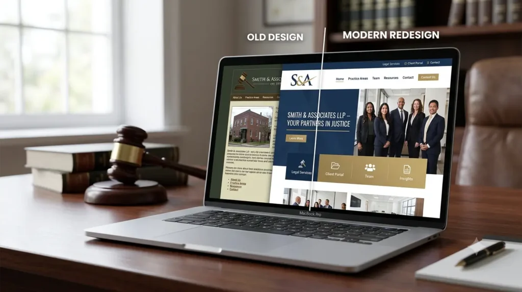
What Strong Attorney Website Design Looks Like in Practice
At Attorney Website Designers, every website we build is designed around one goal: converting visitors into consultation requests. That means mobile-first development, fast load times, practice area pages written for the client, and trust signals placed where they actually get seen.
We build exclusively for attorneys, which means every design decision we make is informed by what actually works in the legal market — not what works for restaurants or e-commerce stores.
View our portfolio →
See our pricing →
Book a free 15-minute call →
Attorney Website Designers builds custom law firm websites exclusively for attorneys across the USA.